Key medals – concept
Posted: May 8, 2016 Filed under: Third Year - "Subject" | Tags: bronze, grief, if, keys. growth. development, loss, medals, poetry, rudyard kipling, set Leave a commentMy initial aim for this project was to create a piece of work, through the medium of the medal, that represents personal growth and development of the self, over the changing stages of life; the repeated fracturing and reforming process as we deal with trauma, loss, triumph, happiness, bonds being formed and others being broken, as we slowly define and refine our sense of identity, and how we define ourselves to others. We select significant events and experiences in our lives, and absorb it into part of our personal narrative, and disregard others, through an ever continuing process of refinement.
This is an important topic to me personally, as now that I come to the end of my university experience, I feel that I have reached the end of an era in my life and come out the end a distinctly different and more developed person than at the beginning. Yet I am both paradoxically, entirely different and completely the same. I have become more, myself, then I have ever been; taking the best parts of myself and exemplifying them, and allowing others to fall by the wayside. However, this is not a finished process, and while I feel I am in a strong and secure place currently I am still in (hopefully) a very early stage of my life which I am sure will feature many more points of turmoil and success in the many years to come. Not only have I changed, and will continue to change, but the events and my perception of these events and relationships do not remain fixed, as we continually revisit the past with the lens of our current self.
It was this realisation, that drove me to use this as a theme for this project, as it is one that is both important to me personally, and that is common to all people and the changing development throughout their lives. The term for this, is known as “Sonder” – defined by The Dictionary of Obscure Sorrows as “the realization that each random passerby is living a life as vivid and complex as your own—populated with their own ambitions, friends, routines, worries and inherited craziness—an epic story that continues invisibly around you like an anthill sprawling deep underground, with elaborate passageways to thousands of other lives that you’ll never know existed, in which you might appear only once, as an extra sipping coffee in the background, as a blur of traffic passing on the highway, as a lighted window at dusk.”
While I originally intended for the work to be representative of this notion as a whole, the different stages and features of people’s lives which change, repeat, fault and interchange; I came to realise through the project that just as the adage often used by writers of books, I can only draw from my own experience. In the end, while having this notion of sonder, and understanding that the lives of all people unfold in just as complex and fundamentally important manners as my own, this is perhaps far too infinite for me to be able to capture and express. I cannot truly know the lives of others, and tasking myself with creating a piece of work which is personally identifiable to all people is something that while I still feel strongly about – is possibly a task taken over a life time, rather than approximately half a year in a final year degree show.
It is because of this, that I decided to make the focus of the medals my own personal life’s narrative, but in a manner that given care, consideration and understanding, is still able to be read and understood by others investigating it’s underlying theme.
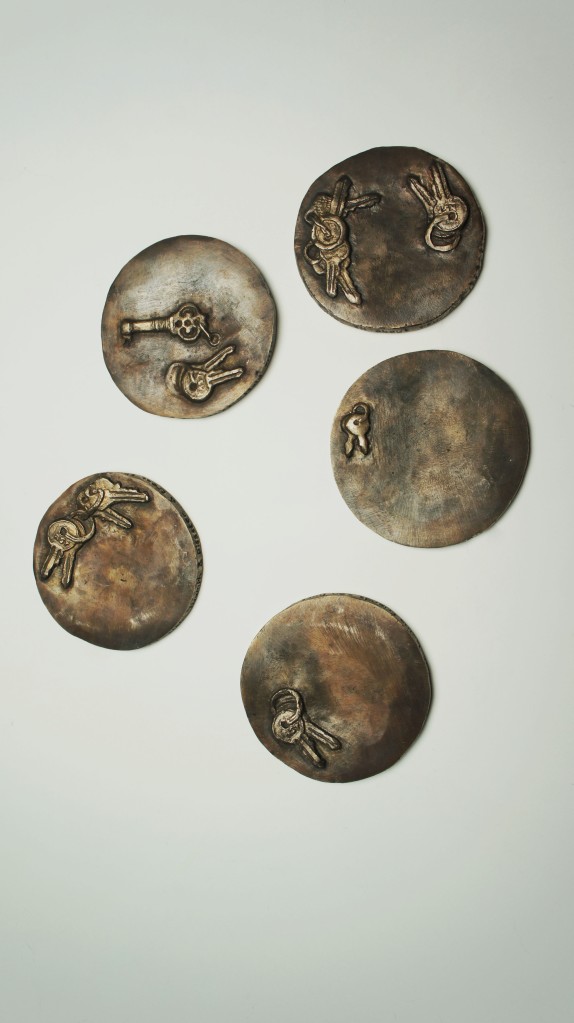
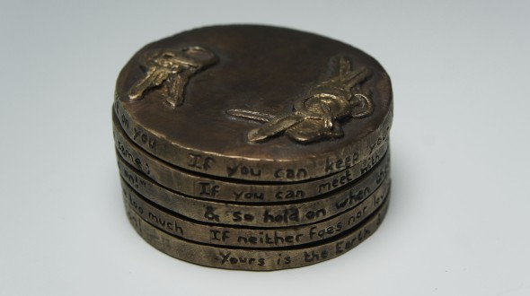
The medals are a set of five, using the imagery of keys, which each represent a distinct stage or relationship in my life.
I feel very strongly about the use of keys as a motif, in that they are objects which are inherently understandable, and yet also able to carry and convey a weight of meaning. Keys are objects that every person carries with them, every day of their lives. They are fundamentally linked to place, keeping you tied to that place – and by extension the relationships and experiences tied there – even if you may be thousands of miles away. Keys represent options, and opportunities; a person with only one key only has access to one thing, whereas a person with many keys has access to many more places, people, objects, facilities. Keys can be freeing, and the absence of them can be constricting. Not only do they carry these meanings in their function, but they are also able to be read visually. The key can range from the simplistic and mundane, to the ornate, complex and beautiful, with each carrying it own identifiable value and associations. As both my subject, field, and dissertation work explores, objects act as containers and vehicles for personal meaning, value, and experience, and some of these values can be expressed and understood wordlessly by others through entirely the form, and context of the object. We unconsciously read the meanings and values given to them by their making in in their use.
It is because of this that I believe the keys to be a strong choice in design for the medals. Each key is able to some extent to be read, simply in it’s form and design, and the viewer is therefore able to speculate what that may represent to me personally.

The medals themselves are sequential, moving through different stages of my life, and only when fitted together in the correct sequence is the poem on the edges revealed.
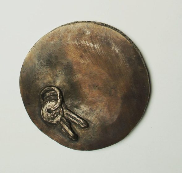
The first key in the set, is a small set of two keys, which comes from a child’s lock box. The keys are small, thin, and flimsy, and functional in the most basic of senses. While they do lock and unlock, they provide no real security, and act as merely a prop to make the child feel more secure.
This is a style of key that is not only understandable as a child’s key in it’s design, but may in fact be familiar to many as it is widely used in children’s products with locks and keys such as money boxes, and I was in fact able to find an identical set on google when looking for children’s money boxes This medal represents the period of childhood, of innocence, a fresh life with no prior experience. Because of this, the reverse side is smooth, polished and clean.
The surface of the second medal, is missing the children’s key from the surface. Instead, there is now a more recognisable, bona fide set of keys, clearly the type used for doors. They are sturdy, and more complex in design, while still being entirely functional, bearing the logo of the key company RST on the front. These are they keys to the front door of my family home, that I was given at a young age around eight or nine. It was around this age that I began to face my first major life conflicts, with my grandmother (whose home we lived in, then inhereted by my mother) passed away, triggering my mother’s first major episode of a psychotic manic episode, leading to her diagnosis of bi-polar disorder, leading to a period of hospitalisation. Shortly following this in the following year, my father was diagnosed with cancer of the kidney which spread to the brain, hospitalising him and having him pass away soon after on my ninth birthday. The again caused my mother to have another psychotic episode, leading me to spend a large part of the next year living with other family members, and visiting my mother in the mental hospital, while coming to terms with my father’s death.
Needless to say, this was a traumatic time for me, and signifies to me a very clear loss of childhood, and a sudden mounting of responsibility, represented by both the new set of house keys, and the painfully absent set of children’s keys. While this back story is clearly not something which will be understood or inferred from these medals, an outsider will not look at these two medals and deduce “this is a representation of the artist’s loss of a father figure as a child and her mother being institutionalised”, they may be able to understand the dialogue; the loss of childhood innocence moving into a different stage of life, and the sense of both loss and new found responsibility and independence.


The third medal in the set, this time shows still the set of house keys from the previous medal, but also a new, more ornate key. This key is in clear contrast to the more practical house keys, looking more decorative than functional, with a complex handle and simplistic locking mechanism. Rather than being held with a sturdy keyring, it is instead held with a set of two small loops, such as you would find on a necklace. We can understand from this key that is perhaps more sentimentally valuable, than for its function as a key, and that this is a new addition in my life.
The key in question, was in fact a gift that was given to me by my boyfriend of five years throughout my teenage years and school. If we understand that the first key is that of a young child, and the second is a first set of house keys, we can then deduce that this third medal is perhaps set in the teenage years of the person’s life, and that they have a new sentimental attachment of some form in their life that they treasure.
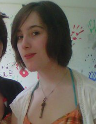
a photo of me in my teenage years, almost exclusively always wearing the key necklace
This relationship was one that was incredibly valuable to me throughout my teenage years, as my life became increasingly turbulent. Teenage years are often a turbulent time for many, a stage of uncertainty and insecurity, beginning to question, search for and identify your own personal values and your relation to others, while also navigating the needs and troubles of others in your peer group. Not only this, but once again I had to face the various periods of my mother’s mania and depression, and while this was not a constant condition – with her often going many years without an episode – the interludes were often filled with an uncomfortable role reversal of parent and child, attempting to manage her general absent presence and alcoholism. My relationship with my boyfriend of the time, and his family, acted as a much needed anchor and support system to fall back upon in these difficult times, in the face of otherwise isolation.
The house keys, both in a literal sense and the symbolic sense representing my relationship with my mother, are still present in my life, despite being an anchor in the suffocating sense, rather than supportive sense of Martyn (my boyfriend) ‘s family. While time with Martyn and his family (represented by the decorative key necklace) is a welcome relief and separation between myself and the family home, the distance – again, in both a physical and symbolic sense – is only slim, and the looming sense of responsibility from home is never far.
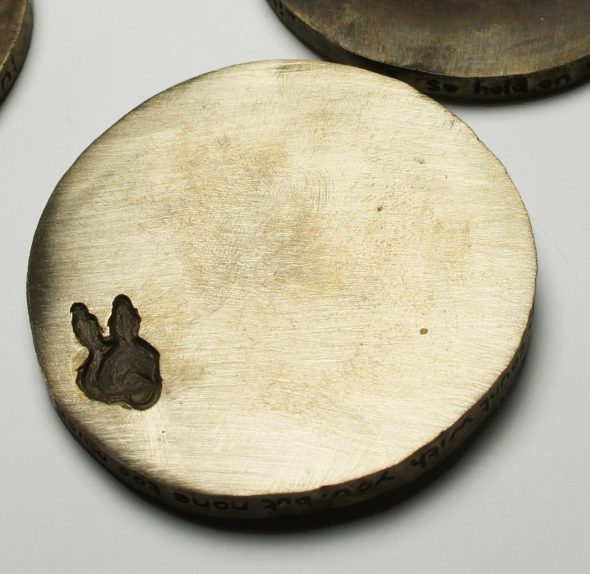
On the reverse side we can see imprints of both the childhood key, and the house keys despite them still being present on the surface. While the childhood key was not present on the surface of the second medal, it is still something that is felt as an absence even into the teenage years. However, the colouring of the childhood keys are less dark than the previous medal, and lighter than the near black tone of the house key imprint, signifying the depth of the loss felt. This is a continuing conflict throughout the medals, the simultaneous presence and sense of absence of the home keys, as it is a continuing theme and conflict throughout my life – of feeling inescapably tied to my home life.


The fouth and penultimate medal in the set, features again the set of home keys, but now instead of the decorative sentimental key, there is another set of sturdy, functional keys. Moving through the timeline of my life, from childhood, through to teenage years, this medal represents early adulthood. This set of keys is in fact the keys to my first flat, which I moved into during my second year of university after spending the first year still living at home, as my family home is in Cardiff. However, after my mother having another manic episode towards the end of my first year at university and the intense stress it was putting me under, thanks to the strong advice and support of the university’s chaplain Paul Fitzpatrick I was enabled to finally move out from the family home after having resigned myself for years that I was to be trapped in that destructive environment.
While I now had more options and avenues of escape in my life, with the new set of functional keys representing my new access to a home other than my family home, in many ways I was more isolated than ever before, and still strongly and crushingly tied to my home life. Shortly after moving out within the first two months of the second year of university, while still recovering from her previous manic episode from the end of the last academic year, only recently having been realised home from the mental hospital, my mother suffered a severe stroke. This left her hospitalised for roughly six months on end, being possibly more dependent on me than ever before. This left me travelling daily on the bus between university, the family home to look after the dog in the empty house, to the hospital to visit and bring support, supplies, and clean clothes, taking away her urine soaked clothes back to the family home to be washed, before finally catching the last bus to my flat. Although it most certainly would have been more practical for me to move back to the family home, I was determined to make full use of my small foothold of independence despite being pulled tighter home than ever before.
Meanwhile, while this is all happening, I am still feeling the loss of childhood – although the child’s keys are now a lighter colour showing my coming to terms with this, and clearly still the conflict of home, but also the loss of my supportive relationship in the form of my 5 year boyfriend and his family, as well as the loss of the family dog whom I loved that I was no longer able to care for.
As we can see from the medal, this was a period of much intense loss, with only the added modicum of independence being gained.


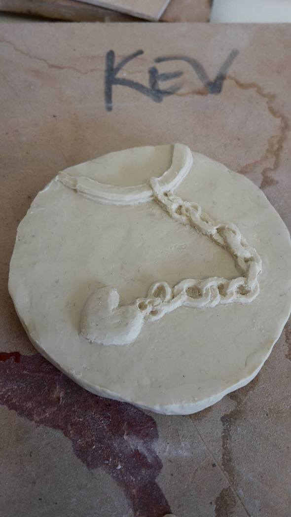
The final medal, while still having the set of house keys, more significantly features an entirely new set of keys, completely separate and overshadowing the house keys. These keys represent my shift fully into adulthood, becoming entirely independent from my home ties. Despite still being present, they are now a far smaller and less significant focus in my life. The new set of keys are they keys to my second flat in which I am living with friends from my course – rather than the previous year in which I was living on my own for the best part of the year. I am both living and functioning happily and autonomously, and although I still face pressures and demands from home I have deliberately put once again both physical and emotional distance between myself and the family home, setting a firm limit on the amount of time that I am willing to spend there. The absence of family life is still felt, although now much paler in colour than the previous medals as I come to terms with this, and there is an loss felt for my time at St Michael’s (my first flat) and the yearning for what my first year of independence could have been, this too is something I have largely come to terms with.
This final medal is far more hopeful, with the gains far outweighing the sense of loss. Not only this, but it marks the completion of the set, allowing all of the medals to come together in order for the poem inscribed on the side to be read.
Each individual medal is a thin and isolated slice on its own, as is any extract taken from a person’s life. Upon meeting a person, we only see and are able to interpret what is presented to us, the current iteration of their self, and perhaps speculate as to what may have come before it. We may, through investigation then reveal different slices and layers of their life, which may seem entirely distinct or perhaps only a very minor change to the version you see in the fully formed person. It is only then by putting these pieces together as a whole, that we can truly appreciate and understand the full breadth of a person and their experience, and understand the sonderous nature of another person’s life in relation to our own.
The lines inscribed down the side of the medal are extracts from Rudyard Kipling’s poem, “If”. They read,
” If you can keep your head when all about you
Are losing theirs and blaming it on you
If you can meet with Triumph & Disaster,
& treat those two imposters as the same
& so hold on when there is nothing in you,
Except the will which says “Hold on!”
If neither foes nor loving friends can hurt you,
If all men count with you, but none too much
Yours is the Earth and everything in it, & what is more
– You’ll be a Man my son! “
This is a poem which fundamentally expresses the process of the development of the self, in the face of both the trials and the successes, and coming out the other side more complete. This poem, and these lines especially are particularly poignant to me personally, while also serving to make the set of medals more easily accessible and understandable to the viewer giving the objects a context in order to decode the imagery and symbolism behind the keys.
Field – Overall Evaluation
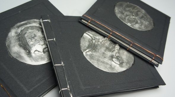
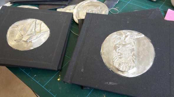
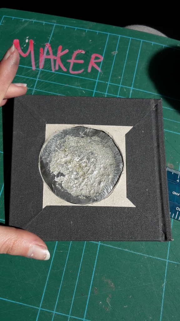
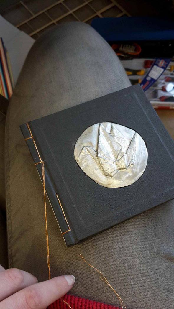
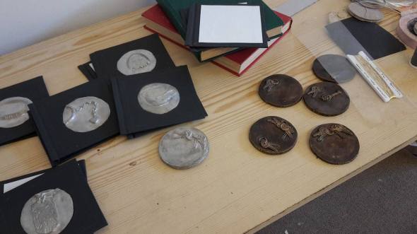
Posted: May 8, 2016 Filed under: Third Year - "Field" | Tags: artist books, bonds, book, books, continuing, crafted, hand made, inlaid, inlay, medal, medals, memorial, memory, object, objects, Pewter, relationship Leave a commentMy Field project consisted of a series of ten handmade artist books, each inlaid with a pewter medal into the cover representing a specific personal keepsake of my own, containing a series of illustrations relating to the object in question and the relationships or events it symbolises, Japanese bound with either gold, silver, or pewter thread.
While overall I am happy with the pieces conceptually, although they are all of an acceptable quality, the execution of the pieces is not at the high standard I had hoped them to be. By far the largest factor in this is of time, and there were many points in the process which were highly time consuming and simply could not be done any faster to the best of my knowledge.
The first point in the process was the sculpting of the objects, which in itself is a time consuming and delicate process, as I endeavoured to capture as many small details as accurately as possible, requiring careful craftsmanship.
However in the process of casting this into pewter, despite the mould having captured the detail well in most cases, I often found that the pewter itself did not pick up much of this detail despite me doing everything advised to optimise the mold (coated with talc/charcoal powder, and heated mould).
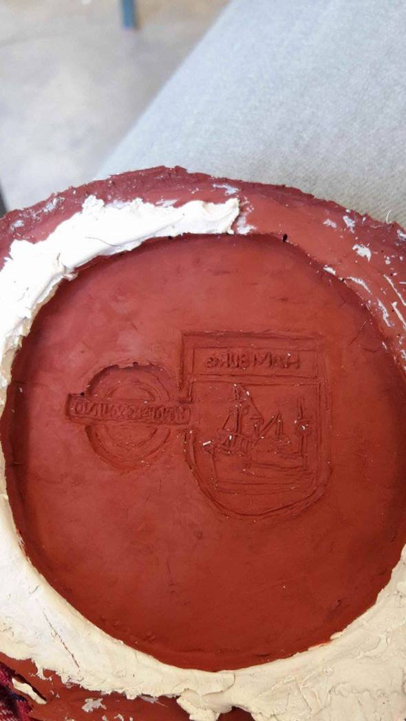
fine lettering and detail is captured in the mold, but not transferred to the pewter
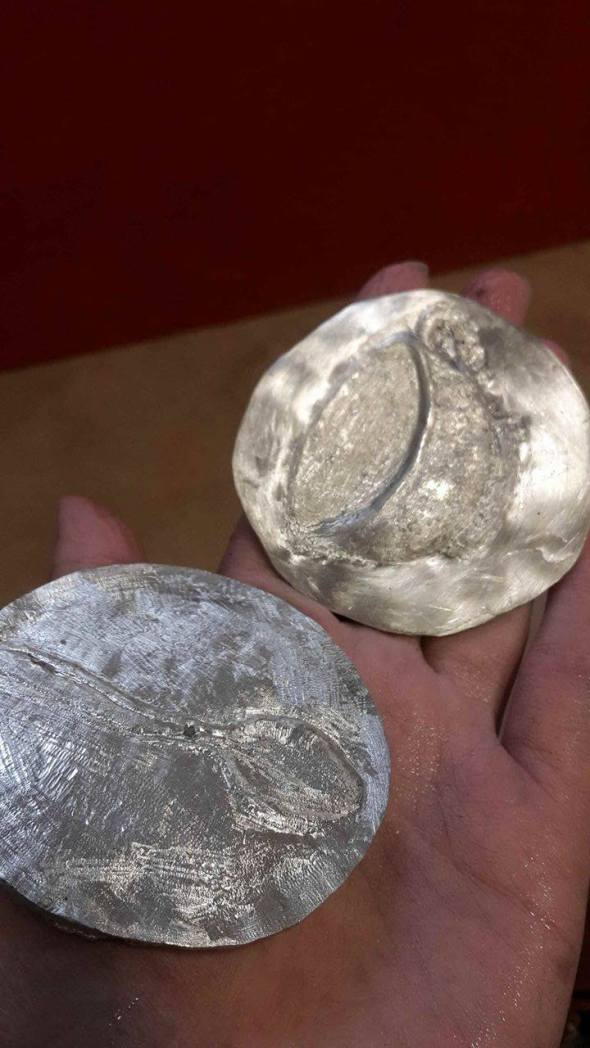
Even having done this however, the surface of the medals consistently came out rough, and neglecting to pick up many of the painstaking details such as the lettering on the surface of the memory stick, or the links of the chain on the heart keyring, and also leaving the previously smooth background with many marks and imperfections.
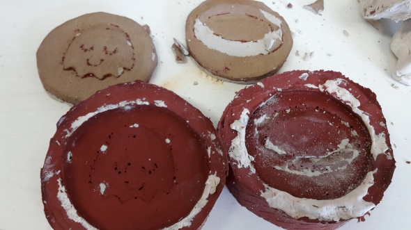
Not only this, but after casting many of the medals which were sculpted into unfired clay (due to time constraints meaning I did not have the luxury to wait for the weekly bisque firing of the kilns), they often broke on attempting to remove them from the set mould. While this largely was not a problem as the moulds still picked up the fine detail, it did make the process much more risky and frustrating in the event of air bubbles being made in the mould causing further imperfections that would have to be carefully removed later.
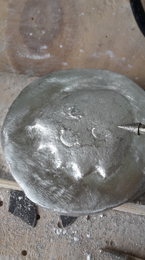
The only way I could find to resolve this lost detail in most cases, was to very carefully draw it back onto the surface using a dremel, which is far from ideal. This is not only more painstaking than the initial sculpting, but also more dangerous as any slip of snag with the vibrating dremel could create an unwanted mark on the surface of the medal which in itself then takes much more time to remove.
As well as drilling the details back into the sculpt of the object itself, I often also used the dremel in an attempt to smooth the background surface also. While I was not able to get the pewter smooth and polished from using the dremel alone, as it often left marks upon the surface, it was useful as a preliminary phase to file down some of the most uneven areas far quicker than by hand using sand paper.
Unfortunately however, polishing the surface with sand paper by hand is (as far as I have been informed) the only option for polishing the pewter to an acceptable standard, and any attempt to use the dremel sand paper heads only seemed to result in more marks being left on the surface. This was arguably the most time consuming part of the process which resulted in the medals not being of the standard of finish I had hoped for. I endeavoured to make sure all of the medals were polished to a passable quality, removing the worst of the marks and kinks made in the casting process and making the surface reasonably smooth contrasting the relief of the object itself, but it is far from a smooth mirrored finish.
In ideal circumstances, with a longer period of time to work with, the medals themselves would be far more polished and flawless, with the reliefs on the surface reflecting the full amount of detail in the original sculptings. This is mostly frustrating as both of these points would be for a large part irrelevant if the pewter had simply cast the surface as it is in the moulds, however if there is a more effective way of casting pewter that does not result in these blemishes (and I assume there must be), I am not privy to it, and the only advice I was offered by the technician ontop of the methods I was already using (heat and talc the mould) was simply trial and error.
The books themselves, again while all containing an acceptable level of content with a series of high quality illustrations, are not finished to the degree I would like them to be in an ideal world.


I would have liked to been able to fill the books with even more illustrations than were featured, but again due to time constraints I was only able to complete so many, and my priority was ensuring that each book had a roughly equal amount of content of an equal standard. Another point I would change if I was to remake the books, is the measuring of the pages, which were perhaps around 5mm narrower than they should have been as when I was measuring and cutting the pages I failed to account for the extra length of the spine. While I do not think this detracts from the books, it is an unnecessary imperfection that I would ideally change.
Another minor imperfection which I did not have the chance to resolve, is the noticeable glue marks on many of the covers. These marks are from glue on the inside of the covers, and expected in the process of book making. However they are most noticeable in the areas around the border of the book which I have embossed, which I originally planned to then gold leaf.
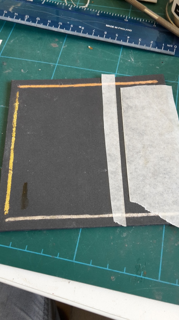
With the gold leaf strips in the embossed areas, these glue marks would no longer be visable and so I was not initially overly concerned by them, However after some consultation with a tutor who has experience in gilding, I was advised that my level of experience with gilding meant that they were “not beautiful enough”, and might detract from the skill of the handmade book. Not only this, but I was advised it may make the covers look too busy and clash with the pewter medal, and that the delicate gold, silver and bronze thread I was using to bind the books would likely be adequate to illustrate my point of value without being overstated.
While I was content not to do the gold leafing on the covers, as it allowed me to invest my time into illustrating and binding the books, I do wish that I had been given this advice when I was first consulted at my initial stage of doing tests on a spare book cover and I likely would not have then embossed the borders of all the covers in preparation for the gilding. Although I do think the embossed border is an effective, subtle yet impactful way of illustrating the pewter medal on the cover, it does raise the issue of the glue marks becoming visible and again given the time constraints I may have been better leaving them plain.
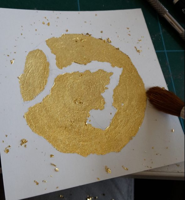
I had also considered using the metal leaf on the inside covers of the books after it was suggested to me by my tutor, however I found that I could not get the level of detail in the edges of the drawings as I would have liked, and again I was told that my skill was not high enough with gilding to produce an effective standard of work; so I instead left the inside covers plain.
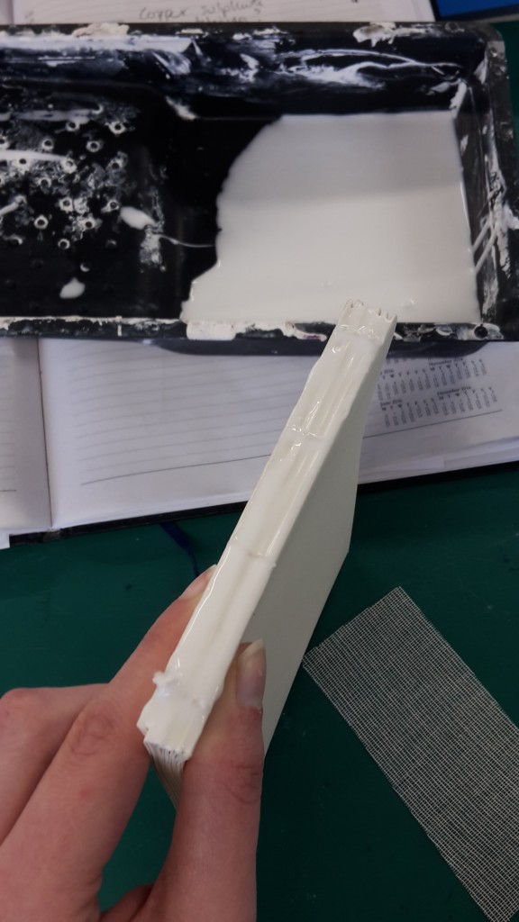
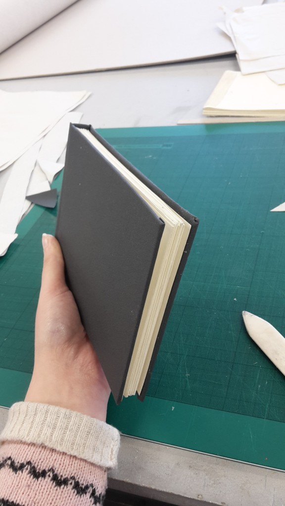
The book covers themselves were fairly straight forward to construct once I was familiar with the process and using appropriate care and precision.
I had to alter this process slightly when making the covers for the Japanese bound books, rather than the traditionally bound ones which I made in my book binding induction. As the Japanese bound books have no hard spine, I had to construct two separate covers. 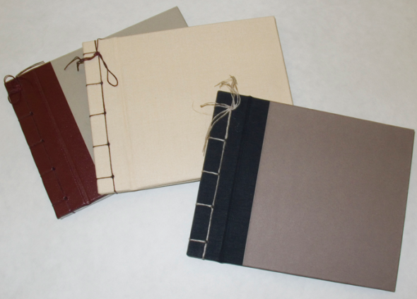
However, most Japanese bound books are made using a soft paper or card cover, rather than being hard bound like mine. Because of this, I needed to adapt my method to accommodate for the folding cover and pages, and so made a thin spine for each of the covers allowing them to bend.
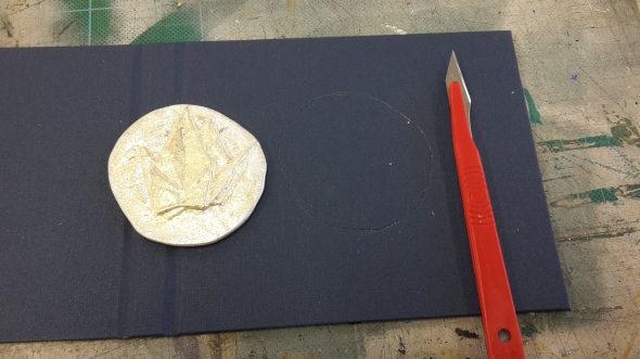
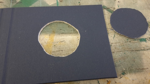
The process of inlaying the medals into the cover was again, a reasonably straight forward if not delicate process. After having glued down the book cover, I then traced around each of the medals and carefully cut this out with a scalpel. This was difficult at times, as the book cover is quite thick and so takes many cuts, which can result in slips or the line being cut to far in or out from where it should be meaning the medal doesn’t fit perfectly. Perhaps, given more time I could have experimented with having the shape laser cut out of the book cover, however not having much experience using the laser cutter since my induction 3 years ago I felt it would be more reliable for me to do it by hand.
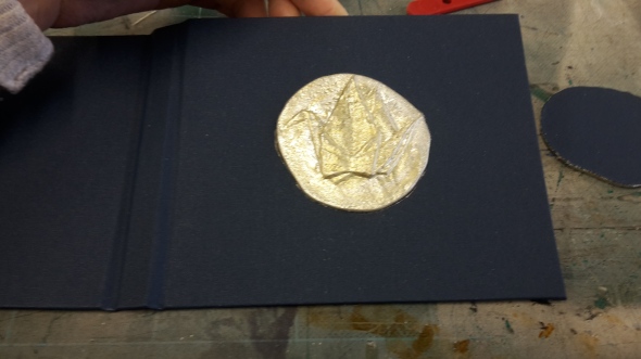
The medal in then pushed into the space, and held in place with super glue, with the inside cover page then being covered with a thick card like paper so as to hide the inlay.
The medals themselves are intentionally non-uniform circles, as I wanted it to be clear that each medal had been individually inlaid into the covers and felt that the asymmetrical nature of the medals’ shape gave them a more personal quality to the books.
The final part of the process was binding the books. After much deliberation, I decided on making the books Japanese bound as this allowed me to illustrate individual images and then experiment with the sequence, as well as use a series of different types of paper, including tracing paper, to strong effect. I had initially planned for the books to be unfolding concertina books for a long time, but eventually decided against this as I would have to be far more precise in planning in advance exactly what images in what sequence I wanted to include, and there is also the issue of joining the different lengths of paper. While it is possible to buy long continuous rolls of paper meaning I would not have to attempt to make joins, these are very expensive especially when looking at more specialist high quality paper, and would again not allow for me to use varying types of paper for each sequential image. Another issue I had in constructing my own concertina book, was I had great difficulty in making the pages uniform. Any slight discrepancy in the height or width of the page, or if it was not folded precisely parallel to the other pages, it became immediately evident and made it look incredibly unprofessional.
I had also constructed a more standard format of book made with page “signatures” – groups of long page strips folded within each other and sewn together at the spine, before being glued into the hard spined book cover. While these books were visually effective, looking possibly the most professional of the various methods, it again had the draw backs of being unable to rearrange the drawings at will, and while different paper types are able to be used, they would need to be in a set sequential and even order.
Although the Japanese bound books do also need to have uniform pages, small discrepancies within a few millimeters do not ruin the aesthetic of the book and are simply evidence of it’s hand crafted nature. As well as these practical reasons, I also found the style of Japanese binding to be the most visually appealing, especially with the specialist thread that I ordered.
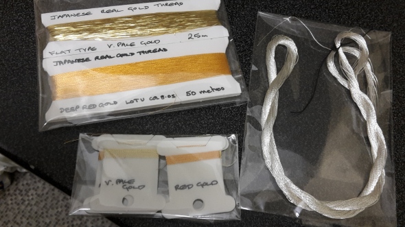
For the large part I am very happy with the use of the thread, and think it adds a beautiful quality to the covers of the books, as well as making them distinct from the usual japanese bound books using linen or cotton thread, these threads – the gold thread especially – were incredibly delicate. Unfortunately I was unable to find metal coated threads in the various necessary colours (gold, silver, and bronze) in uniform thicknesses. The silver thread was the easiest to work with, being a slightly thicker silk thread comparable to the thickness of linen thread which is most typical for book binding. The copper thread while much thinner, was still manageable, and involved me tripling up the thread on the needle before sewing, which was slightly troublesome at times but for the most part straight forward. The gold thread however, was especially difficult to work with. Unlike the bronze and the silver threads, which were standard silk threads coated with metal leaf, the gold thread was flat and ribbon like. This meant that it had much less structural integrity than the other two, and was prone to snapping. Without the time to start the binding again from scratch, and not wanting to waste the valuable thread, I could only attempt to very carefully and delicately tie the snapped lengths back together in a way which is not noticeable from the outside of the book, and although they were durable when I had finished binding them I can only hope that they do not fall apart upon being repeatedly handled. Illustrating this, half an hour before the show deadline after rushing to the photography studio in order to take photographs for my professional practice documentation (website, press pack, and business cards etc), one of the gold thread books got knocked to the floor immediately after I had taken photographs of it, the impact of which caused the threads to burst apart.

It being 30 minutes before the deadline, and with the gold thread being notoriously the most difficult to bind, I did not have time to fix this book for the show. This is a disappointing setback, and certainly in future I would aim to find a thread that was closer in description to the more workable silver and bronze threads, rather than the flat type which I have used for these.
Overall, I am pleased with the format of the books and I feel they are both original, interesting and desirable items. Certainly given more time for finishing, they have the potential to be very high quality and beautiful objects of a professional standard, and also something which I believe to be quite saleable. They combine a set of skills and materials which do not often come together, sculpting, pewter casting, book binding and illustration, with the use of specialist threads, to create a set of unique pieces.
I am also pleased with their display, clearly showcasing each individual piece in a setting alongside their original objects in a manner which is formal, yet not intimidatingly so, and still accessible and inviting to handle. Arguably the best of both worlds, and the ideal form of display for this series of artist books.
Medal books – concept
Posted: May 7, 2016 Filed under: Third Year - "Field" | Tags: book, books. artist books., Field, medal Leave a commentSo far the key theme around all of my work this year has been that of our personal relationships and bonds with the objects in our life. While the object itself may contain little value on it’s own, made perhaps of cheap materials or poor quality, it is what the object comes to represent to us an individual that gives it significance and value to us.
My Field project is a clear development conceptually building upon the research and ideas of my Subject project from Christmas, incorporating my research from my dissertation on the ability for two people to form and maintain a continuing bond through the use of objects. It is a development not only in concept, but also in format, continuing with the use of medals in the tradition of immortalising and memorialising a significant person or event, however with the imagery on the medal depicting the object symbolising this event rather than matter itself. It brings to the foreground the unconscious associations that we make with all objects, and exploits the purpose of medals themselves as objects whose entire purpose is to act as a symbolic talisman, allowing for a trigger or re-engagement with memory. We understand them of being representative of their meaning, rather than evaluating them on their physical qualities, which I aim to show is true of all objects in our lives. These qualities of the medal, combined with the ability of the artist book to express and explore memory through imagery and sequence, makes these books the perfect vehicle for demonstrating these personal object relationships to the viewer.
While the term sentimental value or sentimentality is often one which is used to deride or undermine, suggesting it is something to be humoured or tolerated, I argue that this is not the case. Rather than being a sentimental indulgence, it is in fact a critical part of our ability to form and maintain relationships with one another that allows us to also do this with objects.
In many cases the designed function of the object becomes secondary, whether it be practical or decorative, and the object’s primary function then becomes to act as a symbol representing a person, event or experience. Because of this, not only are we able to surround ourselves with reminders of these relationships, we are then able to use them to actively re engage with and develop them.
In the case of mementos, these may serve a variety of different purposes, depending on the nature of the relationship. For example a gift given by a friend which is kept and used often (practically or as decoration) may serve as a reminder and a maintainer of your friendship bond. Despite perhaps not having seen that friend in some time, through engaging with the objects that are representative of them we are able to feel a sense of security.
However, if the object becomes symbolic of a more traumatic relationship, perhaps a parent, an acrimonious break up, or even a deceased loved one , these objects allow for the vital function of resolution. While the person in question may be absent, leaving you unable to continue a dialogue with them and in a state of emotional turmoil. however by engaging with the objects that are representative of them, it not only allows for the relationship to be continued in their absence but in fact gives the opportunity for growth and development. Rather than our internal image of the person being held fixed in time unchanging, as we each inevitably grow through our own constantly ongoing sets of experiences we may then begin to examine these relationships under a new light with a shifted perspective. The object acts as a grounding point, giving us a tangible focal point onto which we can project our phenomenonological experience of re engaging with personal relationships.
A fundamental part of the object’s nature is the ability to carry many layers of meaning, some of which may be codependent being influenced by one another, and others may run parallel independently. The meanings and?values that objects hold are paradoxically both contained within the object’s form and yet only truly exist within our own mind. Many values are able to be inferred and understood from examining an object in isolation, and so inherently something in the nature of that object must be able to communicate these values non verbally, they exist within the object. However the ability for these values to be read and the way in which they are interpreted depends entirely upon the knowledge , experience and values of the viewer. What to one person may very clearly and indisputably be a drinking vessel, to another from a different culture with a contrasting set of values and experiences may identify it as something else, or find it unidentifiable entirely. It is in this way then that the object’s nature exists only within ourselves.
Because of all this ability to become a focusing point for a multitude of meanings and values, which can be expressed or interpreted wordlessly to an individual, they are fundamental to our formation of self. We define ourselves through the objects we surround ourselves with, and signal to others our values and personalities.
It is then through the examination of a collection of personal objects that we may grow to understand a person in their absence, without words. While we may not necessarily always be able to interpret the precise meanings and symbolisms behind each object, we can as a viewer still understand that it holds some degree of value to the person merely in its presence. While we may come into contact with millions of objects within our lifetime, from gifts to disposables to necessities, it is a select few objects that we choose to keep for extended periods of time. Some objects may be kept for a lifetime, others may be kept for years, months or even weeks. In the case of objects that are kept for long periods of time, this is generally due to a strong sentimental attachment that transcends material value. Even objects that are kept out of necessity or convenience may accrue sentimental value over time, simply for the fact they have played a part in our lives for so long. We fundamentally understand that objects share our experience, and become tangible grounded links to phenomenalogical experience across space and time.
It is this ethos of objects as containers, vehicles and expressors of the self that I explore in my work. The objects I have chosen to immortalise range from the entirely mundane (spoon, memory stick) to the highly sentimental (necklace, pin badges). In the case of the more important items, these are tied to strong bonds between myself and the people they link to, as well as places and experiences. These objects are personally invaluable to me, and are things I often carry with me or interact with frequently. These most important objects are distinguished by the gold thread binding the books, working off the widely associated understanding of gold, silver and bronze as distinguishers for echelons of value.
The silver bound books represent objects which hold a sentimental value to me, but not so much so that the objects themselves are invaluable and could not be discarded or replaced, if not reluctantly. They are triggers for memory and experience, but the relationships they represent have not so wholly and entirely come to have been embodied in the objects as in the case of the gold tier objects.
The bronze range of objects represents items which have no single relationship attached to them, not tied to a significant person or event, but have become significant in my life through their continued presence and use. These objects are linked largely to both routine and place, focused around my university life which understandably has been the focal point of all my routines and actions within the past year. These involve the process of walking, to and around the uni, with my memory stick; an object which I very rarely use in a functional sense but that has become almost like a talisman. A spoon, which has become bent with use attempting to chisel out my solidified instant tea which I rotate between, and often hold the spoon in my mouth absent mindedly. Then finally the origami crane, which was made by a coursemate who had put one on the desk of everyone in our year. These for the most part, remained on everybody’s desk for the next couple of months, and each being displayed and making itself at home in each person’s belongings. To me, these cranes spoke of the place and experience of university, and the community of the course, as well as being reflective of each person’s individual space.
Fundamentally, my work expresses the emotional engagements between the individual and the object, relating to their on personal experience, as well as the object’s ability to then express this and other personal values to others.
Exhibition Construction – Final
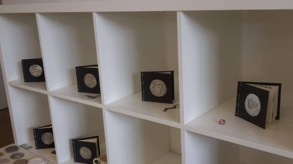
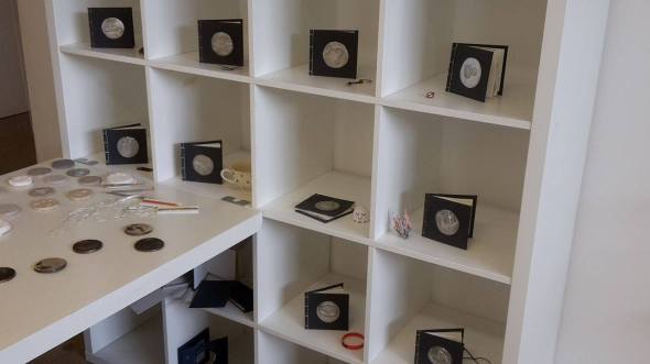
Posted: May 6, 2016 Filed under: Third Year - "Field" | Tags: curation, display, exhibition, final, show Leave a commentAfter having discussed with our subject leader Ingrid, it was decided that my desk was – in her words- “too desky”, and suggested that we instead use a set of the university’s square shelves and her office desk. Being far more experienced with curation, and part of the team marking my work, I decided to take her advice and dismantled my home desk.
While I was sceptical about the use of shelves and a more clinical desk, I have to admit that it is more visually appealing in terms of the show. However, I do feel that it has lost the quality of being an instillation taken straight from my life and constructed in the show. Despite this, I still feel it looks dynamic enough that it does reflect my personality and working environment, and is still an effective contrast from the rest of the show. I am especially fond of the square shelves, and I think that they are very effective at making each of the books stand out and look striking. Pairing the books with the objects was also an effective suggestion by Ingrid, which I didn’t feel was appropriate for the previous. more ramshackle desk as I felt it would look too crowded and take the impact away from the books with the viewer being more interested in the original objects. However, with the segmented shelved books, I think they act as a perfect compliment to the space, and is I choice I think I would have made regardless of Ingrid’s imput, as I had kept the objects on hand for specifically that purpose.
Unfortunatey however, not all of the objects specifically were able to be shown, as in typical fashion the day before putting up an exhibition show, one of them was lost.
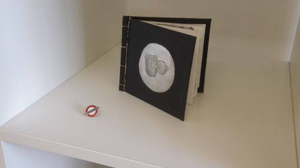
What was originally two pin badges, a London and a Hamburg pin, is now only the one. In the process of drawing the badges the day before the show (as I was completing the books up to the hour of the deadline), I had pinned them to my backpack where they are usually featured. Unfortunately in taking my bag home, it did not occur to me that the badges had not been properly attached, and the Hamburg pin must have fallen off in transit. Thankfully at least the London badge managed to stay intact, but nevertheless it is both frustrating and upsetting to have lost the Hamburg pin. Not only because it is an important part of the show’s display, but because it is one of my most precious personal keepsakes (as illustrated by the show). The London badge was in fact also lost some time last year, and the original badge (as also illustrated in the book), had the word “London” inscribed on the front, whereas the one I mistakenly replaced it with on my next visit to London in fact said “Underground” which I failed to notice as they were otherwise identical. The Hamburg badge however is less easily replaced, as I am not likely to visit Hamburg again any time soon, and I imagine it will be tough to find an identical pin badge online.
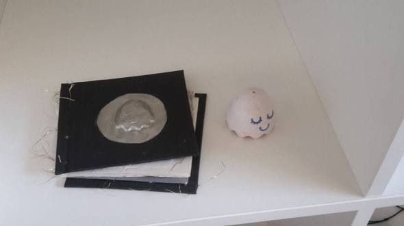
Losing the badge wasn’t the only thing to go wrong in the day before the show, and unfortunately in the hour before the show deadline after just having taken photos of my work, the content egg book got knocked over causing the delicate golden thread to burst open at the impact.
Frustratingly, as the thread was so delicate it is a more time consuming and laborious process to bind the books with the golden thread, so I did not have time to fix it for the show. After having consulted with Ingrid, she said I would just have to display the book as it was and fix it for the public showing. Hopefully, as I have nine other well bound books demonstrating the skill and process the broken book will not detract from my mark, and if this were the case I would hope that Ingrid would have advised me not to put the broken book in at all and instead only display nine intact books.
Overall, I think that I am pleased with the display and that it is a more professional looking version of my original instillation, while still (for the most part) capturing the atmosphere of my own personal space, although without the added decoration of other personal objects as originally planned. While it is not what I originally set out to create, I think it does have the benefit of being a more clear showcase of the pieces of work, although it has lost some degree of the contextual setting of the objects.
Exhibition construction
Posted: May 4, 2016 Filed under: Third Year - "Field" | Tags: CSAD, curation, desk, exhibition, medals, personal objects, set up Leave a commentNow that we’re within the last week of our course deadline, it is time to set up the show! After having spent the previous week constructing the space, putting up the walls, painting them white and sanding them when needed, it is now ready for the work to go into them.
As I have already decided in a previous post, I will be using a desk and therefore do not need to worry about constructing specialist plinths or shelves, so it is simply a matter of bringing them into my space.
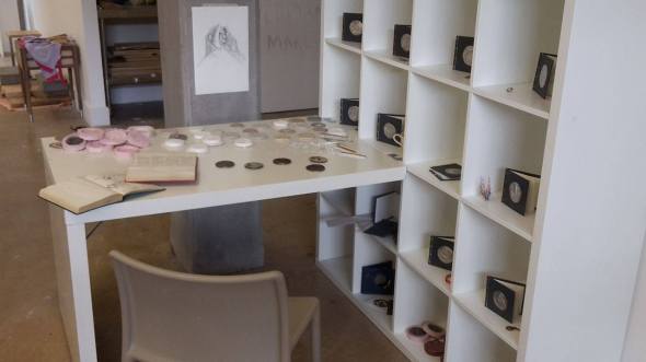
Sticking with the manner of display which aims to capture and recreate a personal environment that is true to life, I have decided to bring my own desk from my bedroom in order to display my work. This desk, while not being a particularly impressive looking desk (a reasonably cheap, shabby, student desk), is ideal for many reasons. While it is true that the desk itself is not particularly impressive, in the same way as perhaps if I had bought a vintage oak desk to display my work upon, a visually appealing item in itself, it is true to life and reflective of my circumstances. It is a practical desk, for somebody who does not have a large budget, and I feel the act of going out and buying a desk specifically for the display would detract from the notion of it being a slice out of my own life and living environment, it would be artificial. Not only this, but I think the fact that the desk is not too impressive or grandiose means that there is no confusion as to whether or not the desk is a piece of the work itself. Again, if I had displayed the work upon a beautiful oak desk there may be confusion as to whether or not I had in fact constructed that desk, especially as it would be in an exhibition next to people who had constructed their own furniture as part of their work. Despite not being an especially appealing desk, I equally do not think that it is so poorly constructed that it detracts from the work. In fact, after having dressed the desk with the various pieces of work and tools, essentially making it a combination of my desk setting at home and my working desk in the university, I do no think the desk itself will take much of the focus, it is simply a setting for the environment I am constructing. Another positive point about this desk is that it is constructed with both drawers and shelves, which I intend to fill with various sketchbooks and objects, a combination of both process work from my project work and collections of items which decorate my room that have not been memorialised in the books. For example the shelves underneath the desk may have a combination of molds made during the project in construction of the medals, and decorative items (figurines, photographs, objects of personal interest) from my room at home as they would be found, in a slightly ramshackle manner. The drawers equally would contain sketchbooks, but also items simply found in my desk drawers in my day to day life, pens, batteries, stray notes and pieces of paper etc. Through investigation, the viewer will be able to examine not only the work and it’s process, but as with Tracy Emin’s “My Bed”, have a view into my own personal life and environment.
With this is mind I began constructing my space, assembling my home desk, and effectively moving the majority of items on my working desk in uni, onto it, recreating my work environment.
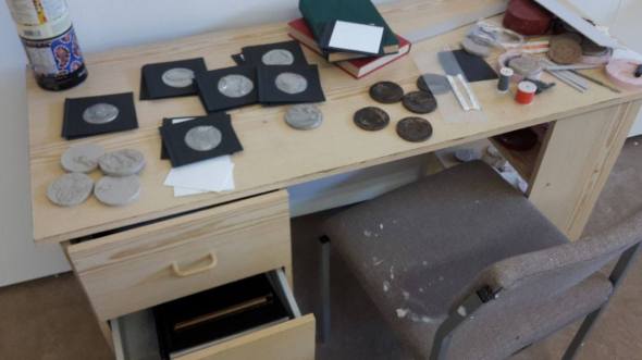
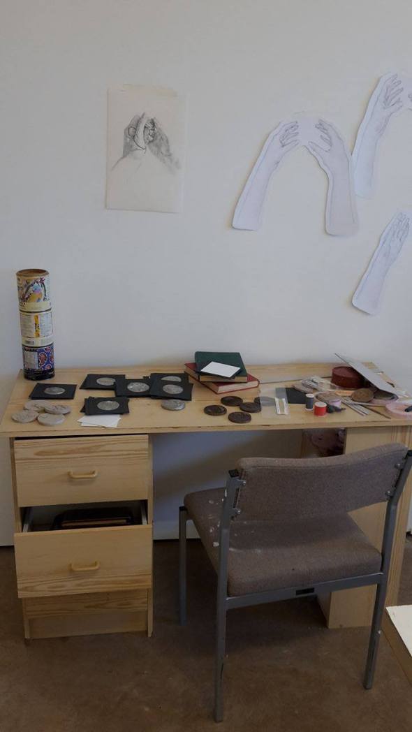
Overall I would say I feel positive about this layout, and it certainly gives the impression of being my personal space. While this is very much at odds with the rest of the show which is constructed of largely white shelves and plinths, I think it is a positive contrast and makes my display clearly defined and demonstrates that this is a deliberate curatorial strategy. Both the medals and the books are easily accessed, but are arranged in a way that is not too precise and suggests that somebody before them has just been in the process of handling them. The objects are not so precious as to be intimidating. The drawers contain a mixture of sketchbooks, and process work, slightly ajar so as to encourage the viewer to open and investigate them, and the shelves holding various molds. The chair, taken from the studio, has splatters of paint on it which is again fitting with the idea of the working desk of an art student.
With the desk built and in place, I can now start bringing other small items from home to dress it with such as my teapot, figures, and bags of clay
Professional Practice: New Zealand Visa Application
Posted: April 30, 2016 Filed under: Third Year - "Subject" | Tags: application, New Zealand, professional practice, Working Holiday Visa Leave a commentAfter having found the form, and filled out the majority of the details required in my last post, all I needed was the information regarding the date of issue of my birth certificate to continue. Having gone home and found my birth certificate, I can now finish the application.

In order to submit my application, I first had to agree to the various conditions that I allowed my information to be verified, everything I submitted was correct and that I was not guaranteed to be accepted for a visa.
After agreeing to all of these terms, and submitting the form, I was then told that I had to pay a fee of $208 (presumably New Zealand dollars) in order for the form to be processed, which works out at £99.38.
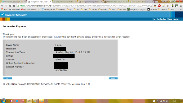
And with that my application has been sent! When and how I hear back as to it’s success, I’m not entirely sure. But I now wait and hope.
Exhibition plan & research
Posted: April 27, 2016 Filed under: Research, Third Year - "Field" | Tags: bed, exhibition, Field, fountain, freud, marcel duchamp, plan, Research, sigmund, tracy emin 1 CommentIn planning my exhibition show, I have always had in mind the idea of my work being presented in a way which encourages the viewer to interact and engage with the pieces. My set of bronze medal are specifically designed in order for them to be handled, and cannot be appreciated fully being displayed on a stand or plinth merely observed. All of my work intrinsically involves an intimate and personal engagement with objects, as extensions and reflections of ourselves, which can only truly be formed in their handling. In order to encourage this, the setting and display is extremely important, as we fundamentally know that the contextual setting of an object dictates our behaviour towards it. If an object is put upon a white plinth, it is clear that it is an object of significance, to be observed and admired, but certainly not touched. Even objects that are usually playful, or mundane, have the ability to be viewed in a completely new light and re-contextualised when placed in a different setting,
For example, Marcel Duchamp’s classic “Fountain” is a perfect example of the setting defining the object.
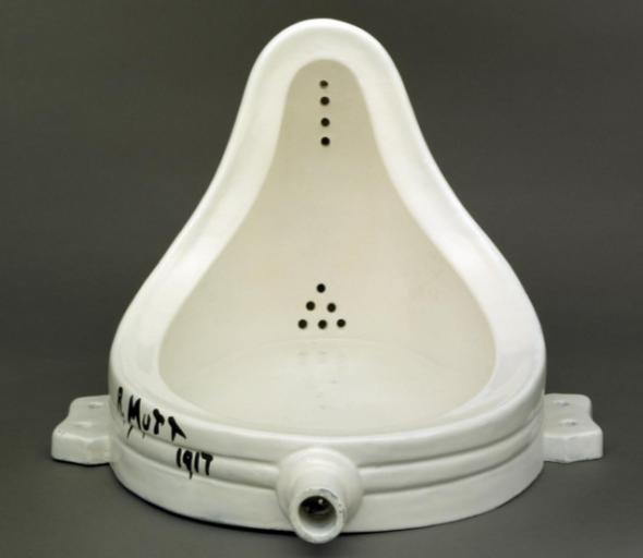
While the object of the urinal has obviously been taken off the wall and laid on it’s back, it is the setting that defines it as an art piece. If a urinal were simply laid on the floor of a bathroom, one would not regard it as anything other than an obstacle. It would not be examine in terms of it’s form, it’s values, the effect it has on the surrounding space or the motivations of those who placed it there. However, in putting it in a gallery setting the object is suddenly given an entirely new platform and a way in which for people to interact with it. It’s form is now regarded in terms of the sculptural, rather than utility; the exceptional, rather than the mundane.
This is the power that the presentation of an artwork holds, of putting an object on a pedestal to be displayed and observed, taken in with time and consideration rather than being merely a background setting for our lives. In this sense, this is almost something that I am trying to avoid. The fetishism of objects within the art world is something that is rife, with pieces being hailed as priceless, beyond all monetary value and worth, so exceptional that they could never possibly be given a value even within the millions or billions of pounds. It is this worship of artwork that separates the viewer from the artist, the god-like creator of beautiful and outstanding pieces that the laymen could never hope to create or even to understand, and can merely marvel and bask at the artwork’s glory. This worship-like regard of artwork, and by extension the artist, has always felt to me to be a largely self serving and self perpetuated ego boost within the art industry. To validate the whims of an artist as being incredibly important and influential, by making all those underneath them as lesser. The separation of object and viewer creates an atmosphere of value, in which the objects in the room inherently have more value than the people who are viewing them. They are the focus of attention, like celebrities on a red star carpet only able to be viewed at a distance by those lucky enough to be able to attend, those who cannot simply looking at photographs.
My ethos however is entirely opposite to these notions. My work explores the inherent relationships between all people and the objects within their lives. Some may hold a very personal significance tied to a person or event within the mind of the owner, while others may be seemingly mundane parts of a daily ritual such as making tea, with their significance and familiarity physically worn into the object through use. Rather than to separate the person from the object, I aim to embrace and exemplify that relationship, encouraging the viewer to engage with the objects on a personal level in order to examine their meanings, ties and histories. In order to encourage a viewer to interact and handle the objects I set out for them, I feel it is important that the objects themselves are not given too much prestige and are presented in a way where they were easily accessible to handle. Height of the object is very important in display; if a piece is displayed on a piece at chest height it may give the sense of a body, giving it a sense of importance and a need for personal space. However a piece displayed closer to stomach or hip height, which is in the range of most of our hand movements is instinctively more appealing to reach out and touch, to pick up and handle, as this is how we are accustomed to interacting with objects in a domestic setting.
I feel the key for my display will be the idea of a domestic, informal setting, where the viewer does not feel intimidated by the nature of the environment (being in an art gallery) and that they are allowed and encouraged to investigate the objects in front of them.
Rather than a plinth or a shelf, I feel that perhaps a free standing desk would be more suitable for the display of my objects. A desk, rather than a plinth, are inherently more informal forms of display and we are entirely comfortable with interacting with objects left on desks in our daily lives. We as humans have an internal framework for how to behave around certain objects or settings, and as we have established already we have been conditioned to treat plinths in a very particular way with a level of respect and awe. Desks however, are a method of display we are entirely familiar and at ease with, and do not feel intimidated by its contents.
Another advantage of the desk is that it can be very versatile in its display. It can be free standing or against a wall, with a variety of different arrangements upon it. Another key factor of the desk is that they are often accompanied by a seat, but can be approached standing or seated. Having a seat is also a strong idea for my display, given that it both welcomes the viewer into the space and puts them at ease yet without putting them under too much pressure. An empty chair is an open invitation that does not have to be taken, the viewer can still inspect the objects from a distance if they choose to, they are not being forced into a foreign space or given an instruction to behave in a certain manner. If they do choose to then sit down, it hold them in place and immerses the viewer in the display, they are sat with the purpose of investigating the items in front of them. Again, this plays upon the domestic setting putting the viewer at ease, putting them in a position that they feel comfortable and familiar with and that they have chosen to engage with and therefore allows them to interact with the objects in front of them in a more naturalistic manner and explore their meanings in the way that you would when entering another person’s home and investigating the objects that they have chosen to surround themselves with.
Perhaps this is the atmosphere I should aim to emulate, the sensation of entering a new person’s house and taking a friendly curiosity in their surroundings. This would involve making the setting as informal as possible, and give the impression of somebody stepping into my own personal space full of my personal objects which are mid-use.
Considering that my work focuses around the relationships between people and the objects in their lives, it would make sense for the display to then emulate that relationship in its setting. Rather than being put on a plinth and admired as Marcel Duchamp’s “Fountain” was, they should be understood in the context that they are displayed in naturally. The context in fact for these objects, it almost as important as the objects themselves for the viewer. While each of the objects in my work is a link for me personally in terms of memory or experience, these are not necessarily qualities that are obvious to another person, devoid of context. It is the setting in which they are used and displayed that can offer that suggestion of an object’s sentimental worth and value, and then encourage that person to question further the nature of that value to the owner.
Examples of this manner of display, the sensation of stepping into another person’s personal space in order to investigate the objects and environment they lived or worked in in order to gain a greater understanding of that person’s personality and values, is one that is seen widely in museums dedicated to people of importance throughout history. Their living environment is meticulously reconstructed, from either the real objects themselves and furnishings, or approximate replicas which convey the same meanings, displayed as if the person had simply stepped out of the room.
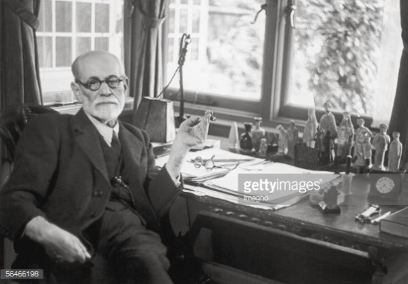
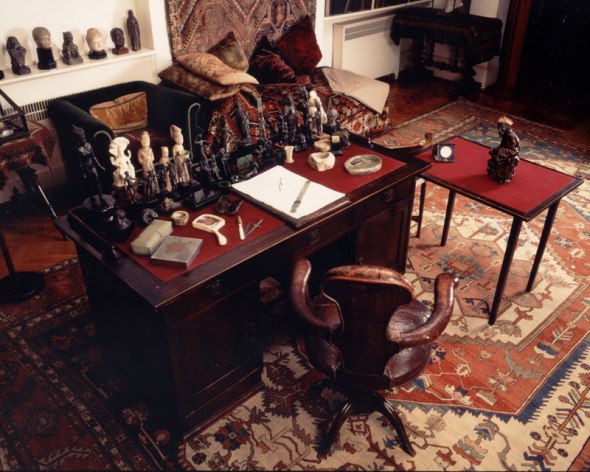
One example of this suggested to me is the desk of the world famous Sigmund Freud, displayed in the Freud museum in London. Here we can see that the room has been entirely recreated, down to the decor of the carpeting, and even the papers and stationary on his desk are true to as they would have been in his life. From this we get a very clear sense of a man, not only his interests but his meticulous nature in the way in which the objects are displayed in a very orderly and precise fashion, which we can see is true in his life and is not simply a choice by the museum to display the objects in an orderly fashion.
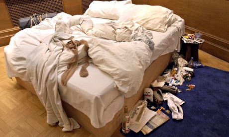
Another classic example of this style of display, but in a more relevant artistic context, is Tracy Emin’s “My Bed”, which is a recreation of her bed which she spent a week in after a traumatic breakup with her partner. The bed is truly an intimate insight into her life, strewn with empty vodka bottles, pregnancy tests and cigarettes, it is almost intrusively personal to the point of the viewer feeling uncomfortable. However, it is undeniably expressive of both her life, her experience, and in this instance her intense pain and turmoil, all of which are expressed wordlessly through a collection of objects in a contextual setting. Through both Freud’s desk, and Emin’s bed, we have a strong and holistic of two completely different sets of people, living entirely separate lives with diverse and differing values, all of which we can interpret entirely from their collection of personal objects and belongings, and the context in which they are arranged. Yet each creates a powerful sense of intrigue as well as understanding in the viewer, and a satisfaction in having made some small degree of connection between themselves and another human being, even if that connection is only ever one sided. It is inherent in our nature that we want to reach out and understand others, and the investigation of personal objects allows us to do this without the pressure of social interaction, and in a manner and pace which is comfortable to us. We are simply allowed to investigate, and to draw our own conclusion without any pressure to qualify or quantify our opinions.
It is this environment that I wish to emulate, a sense of personal space created entirely by personal objects, which hold both meaning for me and serve to facilitate a link between myself and the viewer in order to promote a sense of shared experience.
Professional Practice: New Zealand Visa
Posted: April 23, 2016 Filed under: Third Year - "Subject" | Tags: application, New Zealand, professional practice, Working Holiday Visa Leave a commentAfter some time to recover from my last plight to find the New Zealand Working Holiday Visa, I tried a second attempt at finding it.
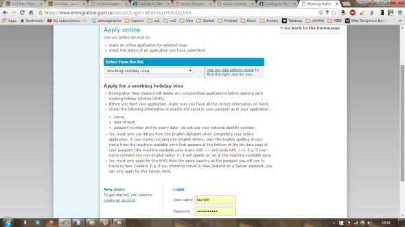
Going back to the original login page seemed like the best place to start
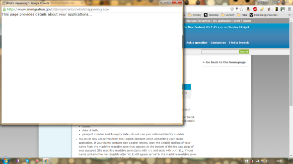
My friend suggested to me that I look at the top at the page, as I was apparently already logged in to the website even though it still gives me the login screen at the bottom of the page. At the top of the page there was a “my applications option”, which we thought might lead me to a screen where I could find the working holiday visa applications, however only this pop up box appeared which never loaded into anything more.
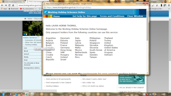
Logging into the generic information screen, we found that instead of following the link to the “working holiday visa” which is on the right of the page, and also under the “work” heading of the page, if you click the “working holiday” on the left side it brings up this pop up window, which seemed promising
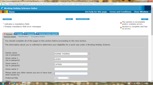
Following through the popup window seemed to be the actual visa application, which was a great relief after the frustration of my last attempt, it seems that this application is actually going somewhere!

I was able to fill out all of the application, my passport details (removed from this screen cap for obvious reasons), my criminal history (none) and area of work, however the only area I could not complete right now was the Second Form of Identification. The only one of these documents that I own is a Birth Certificate, which I do not have to hand and will have to pick up from home in order to find the date the document was issued as I’m pretty certain it is not necessarily issued on the actual date of birth.
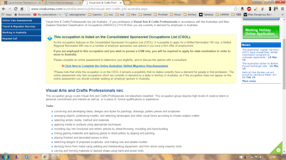
One of the sections requires me to select my occupation, and after having looked through the long (and in some places bizarre) list of occupations, the one which I felt suited me best was “Visual Arts and Crafts Professionals nec” although I wasn’t entirely sure what that constituted and the list itself offered no explanation for each title. Upon googling it I found this description which covered the australian and new zealand visa application descriptions, and I feel that I cover all of these points comfortably. The page also said that there was no minimum requirement for this title, and I will be graduating with a degree in the arts so I should comfortably fit into this category even though I was wary of the “Professional” title.
So thankfully the visa seems in progress, but currently on halt until I can find my birth certificate.
Professional Practice: Book Fair
Posted: April 19, 2016 Filed under: Third Year - "Subject" | Tags: BAMS, book fair, CSAD, New Medalist, prof prac, professional practice Leave a commentOne avenue of pursuing a live application that has been suggested to me is looking at book faires.
My first instinct was to google “Book Fair”, and the top result was London Book Fair 2016.
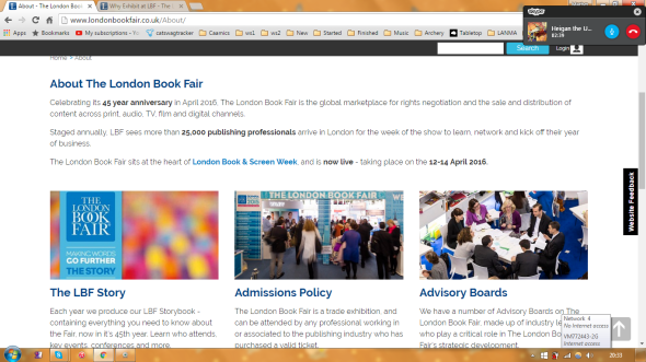
However, from looking at the website it’s hard to determine whether or not artist books would be covered, it seems to be a showcase of more standard format books and so I’m unsure whether or not I would be able to apply. Looking under the small heading of “Exhibitor Profile”, the only information that is given is “1,000+ companies from 67 countries around the world. From the giant houses to the smallest independent, publishers of blockbuster novels and academic texts, producers of children’s books and graphic novels, mobile companies, and gaming start-ups.” While it does seem to cover a range of different formats, including children’s books and graphic novels which are more image-based, I’m not sure whether a set of fundamentally art piece based books would be appropriate. The purpose of this fair seems more to promote businesses, rather than to showcase an individual book or set of books, which I am not producing to sell.
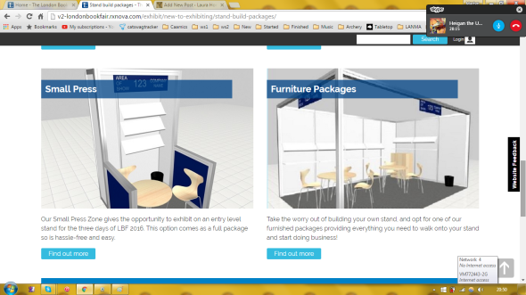
Looking at the exhibiting options, it seems as if what I would be applying for is the “Small Press” package, as I would only require a very small space to be manned by myself
However, after searching around the website for details and prices, I found that the cost for this (the smallest exhibition space), which would be rented for three days in the week long London Book Fair, cost £1,525 +VAT to apply for. Considering that I am unsure whether or not this fair is the right fit for my work to begin with, and that I am not mass producing or particularly looking to sell my set of books, there is no way in which I can justify the cost of renting a stand for this show.
Refining my search to “Art Book Fair” seemed to yield better results, with the top result being Bristol Artists Book Event, a promising title
However, unfortunately it seems that I have just missed the boat with the event, with it having finished last week. After having looked around the website and seeing no opportunity to apply for the next event (assuming it is more than just a one-off show), and the “What’s on” page has no events relating to artists books to show of. Looking again at the Bristol Artist Book Event page again, there was no contact details specifically relating to this event itself so that I could inquire about whether or not it would run again in future. The email addresses found under the “Contact” section of the website relate to the box office (which I assume covers ticket ordering and inquiring), contact for the shop, cafe, room hire, supporting the gallery, and artist’s proposals. Artist’s proposals however cover a very specific format in which the email is structured, in which you are asking the gallery for funding in order to produce a specific show, and I do not feel this would be relevant for my exhibition inquiries.
Then I stumbled upon a promising looking twitter account, The London Art Book Fair (@TheLABF). Unfortunately, the show it seemed to be promoting was on last year “10-13 September 2015 at the Whitechapel Gallery. Celebrating the best of international contemporary art publishing.”. Although the show is clearly over, the twitter account itself seems at least semi-active as it had made a post promoting a magazine on the 30th of March, so I figured I may as well send them a message
Following the link from the twitter account to the website The London Art Book Fair, I found reference to previous years of The London Art Book Fair running, which suggests to me it’s an annual event I can potentially apply for this year or the next
However, the main header of the page only refers back to the 2015 exhibition. Despite the URL of the website being http://londonartbookfair.com/ the website itself seems to be the entire catalogue and upcoming events for the Whitechapel Gallery. Looking around which, I can’t seem to find any information on a book fair in 2016 or beyond. Going back to specifically the book fair page, there is a contact email (as well as the twitter handle, which I have already contacted), so I may as well drop them an email too.
While looking through my emails, I remembered an email which I sent at the beginning of the year, making inquiries about the BAMS New Medalist Scheme, as the information on their website only referred to applications for the 2014-15 run.
Janet was very helpful in response to my series of emails, informing me that at that point they had currently not secured funding for the 2016-17 run of the New Medalist Scheme, and that she would email me in the coming months if they had any news in terms of updates and applications.
With several months having passed now, and I haven’t heard anything back from Janet and the New Medallist website still only containing information on the 2015-16 application, I thought I’d send a short email inquiring about updates
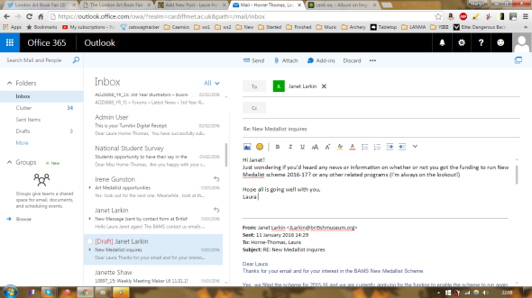
Hopefully I will hear back soon, but currently all my live applications have hit a dead end.
Professional Practice – Post University Life
Posted: April 11, 2016 Filed under: Third Year - "Subject" | Tags: application, New Zealand, NZ, professional practice, Working Holiday Visa 1 CommentMy plans for what I’m going to do post graduation are to spend the next year or so travelling abroad with a friend. My friend Craig has been working and travelling across various places around the world (America, Canada, India) for the past 6 months or so now, and when asking him where abouts in the world he plans to be come July he told me that he will be in New Zealand. He is currently living and working in New Zealand, and his visa doesn’t expire until early 2017 at which point he is currently contemplating travelling to Asia.
Travelling is something I have always contemplated doing, but either never had the occasion, or the confidence to do, and it is certainly a daunting task. While I could potentially travel to any country in the world, alone or with another person or a travelling group, I also have no incentive to do any of those alternatives over the option of travelling to New Zealand and elsewhere with Craig. If anything, having the anchor of meeting with a friend who is in the middle of travelling is a much stronger incentive for me to go, and eases a lot of the fears I would otherwise have simply turning up in a foreign country knowing nobody and with no experience behind me. Travelling with an experienced friend who is already in the country means that I am guaranteed to have a safe place to stay, whether that be an apartment or a hostel which means I don’t need to worry about finding one; he is experienced in picking up jobs wherever he travels, and in the area we will be staying and so therefore be able to advise me in how to get a job to help fund my travelling; and generally give me a companion to travel with which makes the experience both safer and more enjoyable. Because of all these reasons, I am completely content with simply travelling to whatever area of New Zealand (or indeed the world) he will be when I graduate, rather than anywhere else in the world of my own choosing.
Should all go wrong – which I can’t imagine it would as we are both very relaxed and amiable people – I am not in any way tied to travelling with him, and so should we decide we do not want to travel together any more I will hopefully by that point have enough experience to confidently be able to make my own travel arrangements or have found a different person or group or people to travel with, whether that be a separate hostel or travelling to a different location altogether. This and the fact that at any point, I can simply return back to the UK, as part of the Visa requirements for New Zealand are that you carry either an open plane ticket or enough money to buy a ticket home at any given point.

After having registered my interest online for travelling to new zealand a month or two previously, I decided to delve a bit deeper into the visa process now that we are moving closer towards the end of the academic year.
While I have no current set date as to when precisely I will be travelling to New Zealand, my time frame is currently around mid August as many of my friends living around the UK want to see me before I leave, so this gives me a comfortable time frame post graduation to get everything in order.
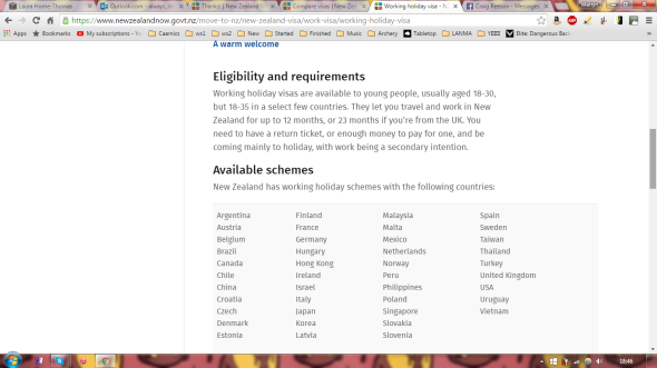
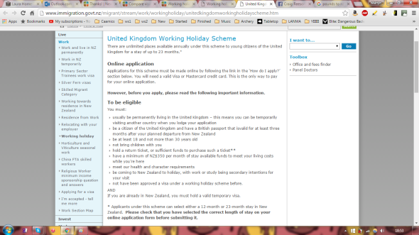
After having done some research, and having double checked with my friend Craig, it seems that what I need is a Working Holiday Visa, which according to the New Zealand immigration website I am eligible for being aged 18-30 and planning on staying for under 12 months.
One of the main criteria for a visa is having sufficient funds to purchase a return ticket, and a minimum of NZ$350 per month of the visa. 350 New Zealand Dollars currently equates to 166.45 Pounds, which for a 12 month visa (the minimum length visa which you can apply for), that works out at £1,997.40, which we can round up to £2,000. Now to find how much a return ticket costs

I couldn’t find any way of booking an open return ticket, which is ideally what I want because I don’t have any set date on returning to the UK, and am not necessarily returning from New Zealand to the UK and possibly travelling on to Asia afterwards (following the plan of my friend). Websites only seemed to want to sell me fixed return tickets with no mention of open returns.

From looking at various websites, the average price for a return ticket to New Zealand seemed to be around the £850 mark
Following the link from the last page takes me to this page on the documentation that you will need in order to work in New Zealand, I will apparently need to apply for an IRD Number. However considering that your IRD number will be sent 8-10 working days after your application is sent, and you can start work before receiving your application, it is something which should be filled out closer to my time of travel or when I begin work, rather than completing it now before my visa has been completed, sent or accepted.

Now that I have officially registered my interest in visiting New Zealand, I am able to apply for a visa

Following the links given to me took me to this page, to apply for a visitor visa, which is not what I need, but it is asking me to create a “RealMe Login” in order to proceed.

After having created a RealMe Login, it did give me the option to apply for a Work visa, however it then told me that I was not able to apply for this through their system but didn’t redirect me to where I do find this application, which was becoming rather frustrating.

Looking at the only other option on this system, the Visitor visa, was not what I was looking for either, and again it only directs me back to the website I had already come from with no specific link. Once again, frustrating

Finally upon going back to the original website, I found that the drop down now gave me the option of a Working Holiday Visa, and now that I have a RealMe Login I can sign in to the website
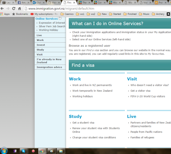
Logging into the website doesn’t take me to the visa form, but rather to a general information page about visas which takes me back to the original information page that I was on.
After having gone round these pages several times, I only seem to be led in circles and can find no trace of the actual visa application itself. At this point all I can say is I’m very frustrated by this inane and out of date system, and I will hopefully have better luck in navigating this website another day.
